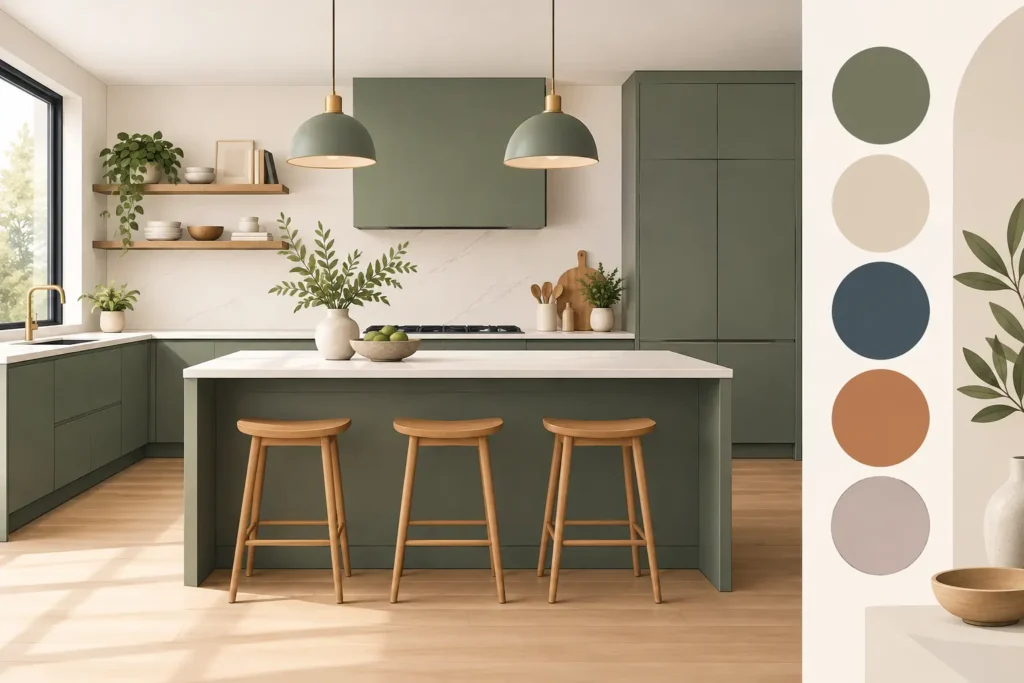
A kitchen colour should still feel right on an ordinary Tuesday morning, not only under showroom lighting or in a carefully styled photograph. That is the useful starting point for kitchen colour trends 2027: a move towards rooms with greater warmth, depth and personality, balanced by materials chosen to earn their place over many years.
For homeowners planning a substantial kitchen renovation, the aim need not be to chase a new shade every season. The most convincing schemes take a current direction and make it personal to the house, the available light and the way the family uses the room. In Dorset homes, where kitchens often need to work hard as a living, dining and entertaining space, colour has a practical role as well as a decorative one.
Kitchen colour trends 2027: warmer, more considered schemes
Cool grey kitchens have had a long run, but the direction of travel is clearly warmer. This does not mean every kitchen will become cream or beige. Rather, the neutral palette is becoming more nuanced: putty, mushroom, oatmeal, clay, soft stone and warm taupe bring an easy, settled quality without looking flat.
These shades work particularly well for cabinetry because they provide a calm backdrop to natural timber, textured tiles and practical stone or composite worktops. They also tend to sit comfortably with the changing light through the day. A north-facing room may benefit from a neutral with a gentle yellow or pink undertone, while a bright south-facing kitchen can carry a deeper, earthier shade without feeling heavy.
The important distinction is between warm and yellow. A sample that appears welcoming in isolation can look overly creamy beside white walls or a pale worktop. Seeing full-size colour and material samples together in the actual room is far more reliable than choosing from a small swatch.
Greens grow more complex
Green is expected to remain one of the strongest kitchen colours into 2027, although the brighter, more obviously decorative versions are likely to give way to quieter, muddier tones. Think olive, lichen, sage with a grey base, eucalyptus and deep moss rather than sharp mint or intense forest green.
Green has an unusual versatility. In a period property, it can emphasise character and pair naturally with aged brass, oak and painted timber. In a newer home, a muted green can soften clean lines and make a large open-plan room feel less stark. It is also a reassuring choice for homeowners who want colour but are not drawn to blue or black cabinetry.
A deep green island with warmer neutral perimeter cabinets is a sensible way to use the shade. The island becomes a feature, while the overall kitchen retains flexibility. In a compact kitchen, however, using one dark colour across every cabinet can reduce the sense of space. It may still be the right decision in a light-filled room, but it needs careful planning around windows, flooring and lighting.
Red-brown, plum and mineral tones add confidence
The more expressive side of the 2027 palette is likely to be led by red-based earth colours: terracotta, burnt umber, cinnamon, brick, oxblood and softened plum. These shades have a richness that suits kitchens being used more like furnished rooms, particularly where there is an adjoining dining or lounge area.
They are not an automatic choice for every home. A full run of dark terracotta cabinetry can be striking, but it asks more of the surrounding finishes and may feel dominant in a smaller space. Used on a pantry wall, island, glazed dresser or lower cabinets, these colours can add depth without overwhelming the room.
Mineral-inspired blues also have a place, especially softened slate blue, smoky teal and inky blue-grey. They offer more character than a conventional navy, while still working well with pale timber and light worktops. Where a kitchen receives limited natural light, choose the undertone carefully: some blue-greys can appear unexpectedly cold once installed.
Two-tone kitchens become more architectural
Two-tone cabinetry is no longer simply a dark island against pale wall units. The more considered approach for 2027 is to use colour to organise the room. Tall units might be finished in a grounding mid-tone, base cabinets in a contrasting colour, and upper storage in the lightest shade or removed altogether in favour of open shelving.
This method can make a large kitchen feel more deliberately designed. Tall cabinetry often houses appliances and larder storage, so a darker finish can allow it to read almost like furniture rather than a bank of units. Lighter bases or wall finishes then keep the working area open and bright.
Tone-on-tone schemes will be equally relevant. Combining mushroom with deeper taupe, or sage with an olive accent, creates definition without a hard contrast line. This is often a better route for homeowners who want visual interest but prefer a quieter, timeless result.
The cabinetry design matters as much as the paint colour. Flat-fronted doors suit contemporary tonal schemes, while framed or shaker-style doors can carry earthier shades beautifully. Bespoke manufacture allows the proportions, door style and colour placement to be considered together, rather than forcing a room to suit a limited range of standard cabinet sizes.
Natural materials are part of the colour story
Kitchen colours in 2027 will not stand alone. Timber, stone, metal, glass and wall finishes all influence how a cabinet colour is perceived. A green that looks soft beside pale oak can become sharper alongside a cool white quartz. A clay-painted door may look beautifully understated against honed stone but much stronger next to a heavily patterned worktop.
Wood is set to play a larger role, whether as a full bank of veneered cabinets, an oak breakfast bar, internal drawer detailing or open shelving. Lighter oaks remain popular, but medium and smoked timber tones bring welcome contrast to pale kitchens. The most successful rooms avoid matching every wooden element exactly. A little variation in grain and depth gives the space an established, lived-in feel.
Worktops are also becoming less uniform. Honed or matt surfaces, gentle veining and warmer off-white stones are likely to appeal more than icy, high-gloss finishes. A busy natural stone can be a wonderful focal point, but it should lead the scheme. Pairing it with equally dramatic cabinetry, splashbacks and flooring risks making the room feel unsettled.
How to choose a colour that will not date quickly
A lasting kitchen palette is usually built around your fixed elements, not a predicted trend. Start with the floor, the amount and direction of daylight, adjoining rooms and features you plan to keep. Then consider the visual weight of your cabinetry. A wall of full-height units occupies far more of the room than a small island, so it deserves the quieter or more enduring shade.
It is wise to reserve the bolder choice for elements that can be changed more easily. Painted accent units, stools, wall colour, lighting and splashback details are all opportunities to introduce a fashionable note without making it the entire investment. That said, a strong cabinet colour is not a mistake if you genuinely enjoy it and the design has been properly considered.
Practicality should guide the finish as well. Very pale matt doors can show marks around handles, while very dark matt cabinetry may reveal dust and fingerprints in a busy family kitchen. Handleless designs look clean, but need good-quality mechanisms and sufficient grip detail to be comfortable every day. Colour and function should support each other.
At Hale & Murray, our approach is to view colours in the context of a complete, made-to-measure design. Samples can be assessed alongside worktops, door styles and the light in your own home, before the furniture is manufactured and installed. That consideration is often what separates a kitchen that looks good initially from one that continues to feel right years later.
A good colour choice should feel like home
The strongest 2027 kitchen schemes will not be the loudest. They will combine a warm foundation, a material-led palette and enough contrast to give the room character. Whether that means olive cabinetry and oak, soft taupe with a plum island, or a quietly tonal neutral scheme, choose the colours that suit your home and the life taking place within it. A free design consultation is a useful opportunity to test those decisions properly before committing.